Have you noticed the turds?
Before I begin, let me say that I’m not dissing Generated Adventure or the people who created it. They made a very impressive tech demo in 72 hours, and if you don’t look too closely, it’s rather pretty. They were under tight time pressure, and they were specifically aiming to use only AI tools. They did better than I would have in 72 hours (although as a parent, the idea of devoting 72 straight hours to anything is totally unimaginable). It’s good enough to make me consider Deform over Godot for a project like this (I’m sure either could handle it, but they did it so fast!).
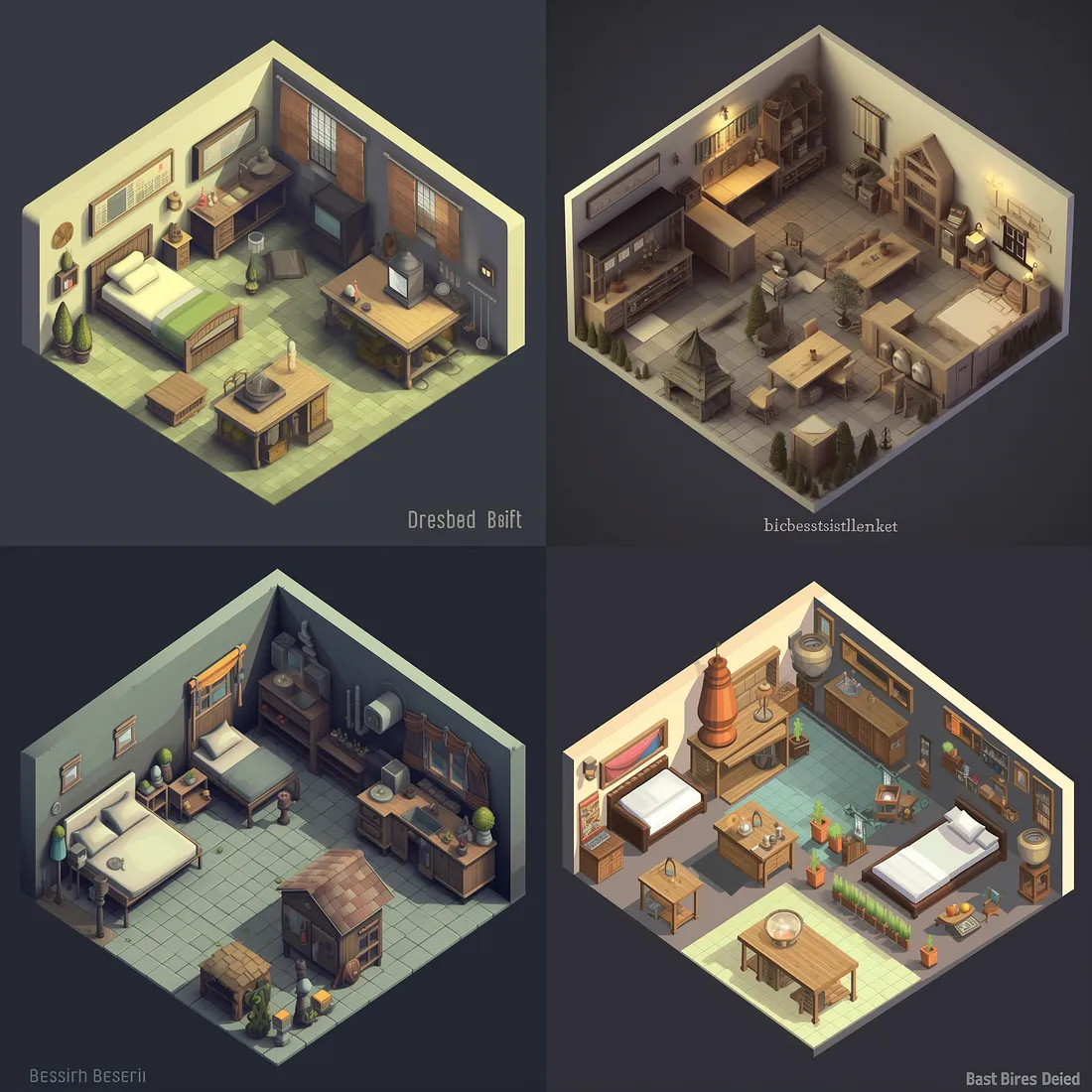
But I feel like something that gets lost in the discussion of AI-generated artwork is the turds. Here’s an example of what I mean: it’s one of the sets of images that Midjourney generated for Generated Adventure (I don’t think any of them ended up being used for the game).

At first glance, it’s fine. But then you notice the turds.

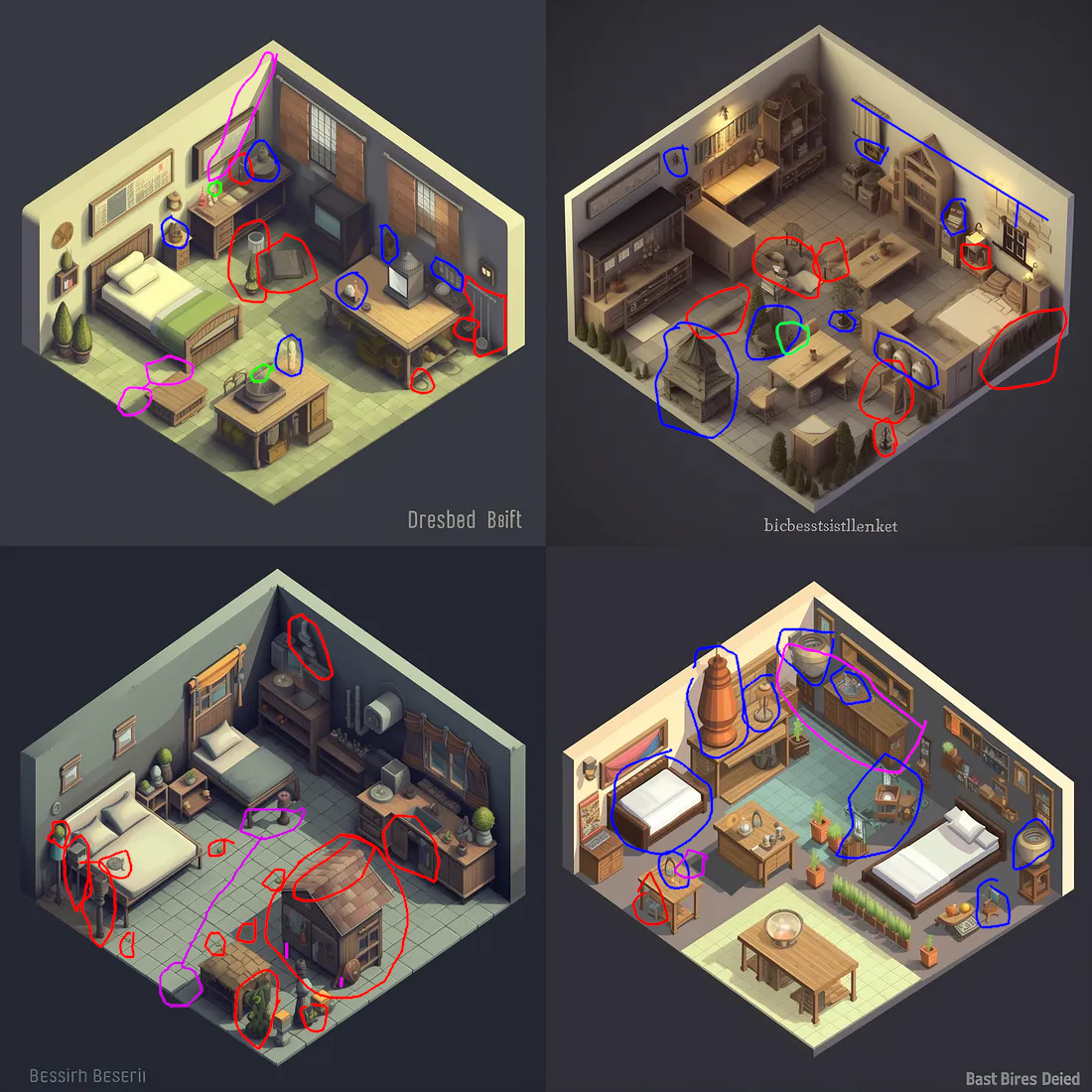
Here’s what I mean. Green marks blurry object edges, which I’ve complained about before. Some of these might be the webp compression of the image from the Medium post, so I haven’t been too harsh here. Purple marks bad angles: shadows that don’t match, a wall that’s also a floor, and different-length legs on a … well, I have no idea what that thing is. Blue generally marks things that are unidentifiable, although in the top-right one, it marks the only floor-tree (?) that has a pot. Unidentifiable stuff is a venial sin; it’s a fantasy game, and sometimes there’s weird stuff in a fantasy world.
Red is the real turds. Stuff that is so our-of-place as to break immersion. Often it’s unidentifiable, but sometimes it’s just in the wrong spot (like the faucet in the top left which isn’t over a sink). The bottom left has a fractal turd: the roof of the hutch has a weird asymmetrical fold at the top, but also, a bedroom should not contain a hutch with an outdoor roof.
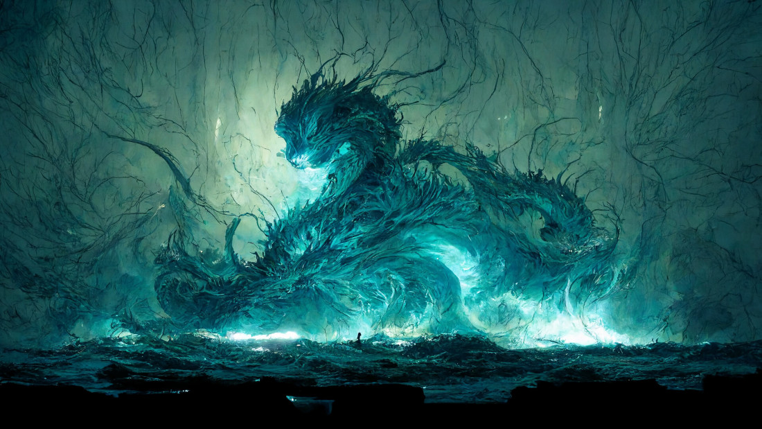
Once you start looking at AI-generated art, the turds are everywhere. Midjourney often “solves” this by doing images that are impressionistic rather than representational. I googled for “Midjourney dragon”, and this was the first hit:

Other than the inexplicable human figure (?) in the center of the image walking on water, this doesn’t have major turds – but it’s also clearly intended to impressionistic rather than to represent a real scene. I should note that several of the other images from that source do have turds, such as phantom Chinese-looking characters. Side note: I wonder why the dragons are disproportionately looking to the left. In one image, the main dragon head is looking to the right, but clearly that was unacceptable, so there’s also a secondary head-turd looking to the left.
Music
I’m not any good at music, so I can’t immediately identify the musical turds in the AI-generated music from AIVA. This is what Generated Adventure used. AIVA seem to be generating MIDI files, so they won’t have the same sorts of errors as AI image generators, which operate on a pixel level. But I can say that their prompt following is bad. I uploaded the first track of the Surfwords soundtrack to AIVA. Here’s what it sounds like:
That’s a track composed by a human. One of the tracks that I sent him as inspiration was this one (skip to 0:24):
He nailed it! Patrick’s track is maybe a little less skrawnky, but it definitely captures the feeling and instrumentation.
Compare AIVA (I uploaded Patrick’s track rather than the Moon Hooch as a “influence”, since I have the rights to it):
Sure, the BPM is the same (according to a random online BPM detector). Maybe the key signature is also the same? But it’s not even the right instruments – AIVA suggested “Clean Rock Ensemble” for this track, but my track is brass. (AIVA’s generated tracks with the same influence on the Brass Ensemble setting sound even less like the original).
If you don’t have a vision in mind for what your music sounds like, AIVA is maybe fine. Like, it sounds like generic music. But if you do have a vision in mind (as I did for the Surfwords music), AIVA is not there yet.
Conclusion
Please don’t tell me about how I could fix this by twiddling the Midjourney or AIVA prompts.
AIVA’s config options seem to be designed for people who understand music much better than I do. Maybe it’s a good tool if that’s your situation. But why offer to let me upload an influence, if you aren’t going to do anything other than extract the BPM and key signature? At least get the instruments right!
And yes, you can paint out the turds in Midjourney and tell it to fill in the area again until it gets it right. But the shadows are still going to be annoying, and the iteration time is painfully slow.
Soon, this might be fixed. But not today. It’s frustrating to be so close, and to have everyone hyping how close we are, and to be stuck with turds . (Also please don’t say mean things about the Generated Adventure folks, who set out to do a thing and successfully did the thing; none of this is directed at them).
Next post: A review of one puzzle from Quern: Undying Thoughts
Previous post: Dev journal for Deco Deck, my new indie game