I’ve decided to republish a book. Someone on the fediverse – I can’t remember who – said that Professor Mmaa’s Lecture was their favorite book. So I wrote to the rights holder to see if I could get it back into print. Sorry, I know I’m supposed to be working on the game, but it’s been a busy summer and I’ve had a hard time getting a free moment. Also, I first inquired about these rights a couple of years ago, but just heard back. I’ve been telling everyone that I bought my first book ever, just to confuse people.
The agent that I ended up speaking to was a little surprised to hear from someone who had never published a book before. I can only plead that I have figured out how to make games, so surely I can figure out how to make books happen. Also, I happen to know a fair bit about copyright law since I used to work on legal issues in software freedom. (Actually, I apparently know more about copyright law than Amazon, which initially rejected the book because they thought it was in the public domain. They relented when I explained.) You can just do things.
What follows are some notes on what the process has been like. To start with, the contract. I feel confident that I could have written a book contract, but why bother, because the Authors Guild has a great model contract. I mean, it’s great for authors (as you would expect). But also, it explains the reasons behind each term in clear English. I didn’t want to use it verbatim because this is a reprint, so the rights issues are different (and I disagreeed with some of its terms). Claude made me a new contract inspired by the Authors Guild one, and I confirmed that it was what I wanted. I had to remind Claude about the read-aloud issue; obviously, I want the book to accessible to blind and other reading-impaired people! And its internal review of the first draft surfaced like nine missing clauses. Ask Claude to review its work; you’ll almost always find something worth fixing.
Then it was time to prepare the text. In the old days, Dover would do photo facsimilies of public domain works they wanted to republish. This was not beautiful, but it totally did the job with 20th century technology. We’re in the 21st century now. You can scan a book and OCR it. OCR often gives weird scanning mistakes, especially if your book has non-English text interspersed. Historically, you would clean them up by hand. Now we have LLMs to do it for us. I should warn that this is not 100% perfect, especially as regards to formatting. Professor Mmaa’s Lecture has illustrations, tables, subscripts, small caps, italics, etc. They all have to be manually checked. But I have found no errors in the text itself. You might thing it’s easy to find scannos – just search for non-words. But this book is full of hapax legomena. “Brillat-Beetonin”, “kcourage”, “Homomahomet”, “abbovvve”, “Maetermith”, to name just a few. Oh, also, untranslated French. LLMs do it without breaking a sweat. Archivists have known about this LLM superpower for a couple of years.
I had initially thought that I would work off the Internet Archive’s scan of the book. Unfortunately, their scan is the 1975 edition, and the rights holder wanted me to use the 1953 edition. There are pretty major differences – the 1975 edition is actually almost 20% longer. There are new bits everywhere. Here’s one:
“If we add to this the thesis propounded by the very reverend Archussher, who, basing his conclusions on right-to-left consumption of the collection of cellulose which consumed from left-to-right is known as Genesis v, declared that according to homo itself its appearance took place at nine in the morning of October 28, 4004 B.C. of the homo calendar&emdashwe shall realize what discrepancies there are among the various estimates of this mammifer’s age, even if we agree to call homo what by some scientists is called ’notyethomo,’ and by others: nomorehomo.
In addition to the new bits, the 1975 version has some minor rewordings – like, “everyone” gets the MLP treatment and becomes “every termite”. It also has American spellings. And it doesn’t have Bertrand Russell’s preface.
So then I thought I would just photograph each page and have Claude OCR it. Tedious, but doable. Just to test it out, I went to the Claude web interface and asked it to do the first page. It refused, citing copyright law. Buddy, don’t you remember how you, yourself, were trained? Anyway, it suggested instead that I use a book-scanning service. Why are you giving me instructions about how to “infringe copyright” after refusing to do it yourself? (It didn’t believe me when I told it, honestly, that I had the rights).
I found a place called 1DollarScan. They said to email them if I wanted the original book back, so I did, and then they quoted a price that was… not one dollar. Indeed, it was closer to a dollar a page. So instead, I went with Bound Book Scanning. Their pricing was much more reasonable (still not one dollar), and they did a great job.
And Claude Code doesn’t seem to care about copyright. I mean, it politely asked if I had the rights to Bertrand Russell’s preface before including it (I didn’t, so I went out and got them). But otherwise, it’s perfectly happy to clean up scans. It’s not quite the same job – it’s working from an existing scan rather than doing 100% of the OCR itself. But actually Claude Code ends up doing a bunch of OCR anyway.
It’s a little scary to entrust text to a LLM – they are famous for hallucinating. (I know some people think that hallucinations have been fixed – they haven’t. I just asked Claude to find me some boxer shorts, and it confidently, wrongly, asserted that Israel doesn’t have an underwear industry.) But for OCR, it turns out that Claude can do a good job even with text that’s somewhat out-of-distribution, like this novel.
Some decisions need to be made specifically for ebook publication. Lots of people read books on their phones, which means that poetry will, unfortunately, have extra line-wraps. Consider:
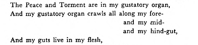
Here, fore-, mid-, and hind- are all aligned at the dash to indicate that they all refer to sections of the gut. But on my Pixel 9, with default Kindle settings, portrait mode, “And my gustatory organ crawls all along my” takes up a whole line, wrapping fore- onto the next line. We decided to wrap “my” onto the next line, and keep the dashes aligned. There’s no perfect solution here, but I think this does the best job of preserving Themerson’s intent. Claude took a few tries to get this to look right on various screen sizes, but managaed in the end. And of course, if you have a larger screen, and in the print version, we won’t wrap.
That’s an aesthetic challenge; there were also technical challenges. There’s one bit in the book where “the Detective imitates the sound of the old Enemy of termites – the Dove.” This is rendered as… well, I don’t actually have names for these characters. They’re straight lines and arcs, with accent marks. I almost ended up rendering the arcs as U+2323 SMILE; the straight lines as em-dashes and vertical bars. But using combining accents didn’t render right, so Claude suggested using ruby, which I had known about (I tried to learn Japanese at one point) but wouldn’t have ever thought to use. Brilliant idea, except that the Kindle renders the ruby too far above the smiles, and it doesn’t support the CSS necessary to fix it (we discovered this after Claude built me a little tool that would let me interactively adjust the size/height of the accents to get it just right). So, not actually brilliant. Then I tried using images of Themerson’s original glyphs instead. But they were black-on-white, which looks bad in dark mode (and Kindle doesn’t support the CSS that would let me select different images for dark mode). The final plan ended up being to trace Themerson’s notation into a font, and embed the font. Yow.
Anyway, after a bunch of irritating formatting tweaking, the 1953 original text of Professor Mmma’s Lecture was ready to go!
Oh, and I needed a web site, which meant a domain name, and thus a business name. I do most projects under my own name, so that everyone knows what they’re going to get: something weird. But publishers tend to have business names, and anyway it felt odd to have my name on a book someone else wrote. I chose the name Picolibrary to emphasize that this was just a small side project. I know sometimes small projects get big. Bennett Cerf said, “we just said we were going to publish a few books on the side at random”, but ended up with Random House. I do not expect this to happen to me. Still, I have a bunch of spare ISBNs (in the US, if you want two you might as well buy ten), so anything’s possible.
I asked Claude to put together the site, and it came up with some hilariously Claude text about what the press is and what its mission is, all totally made up. It genuinely used the word “genuinely”, in case any readers were genuinely unsure whether or not it was slop. I deleted it and used my own voice. (To be clear: this was always the plan; I don’t use AI prose generation for anything I share with others, as I find it painful to read).
So now if you want to read one of the weirdest books I’ve ever read (and I’ve read House of Leaves), now you can read Professor Mmaa’s Lecture. It’s about what it’s like to be a termite. Bertrand Russell recommends it!
I listen to a lot of podcasts, because I can listen while making art for the diorama-based game I am working on. I discovered the podcast Imaginary Advice because MetaFilter linked to its episode on the SNES game A Christmas Carol. That’s a game that doesn’t exist – Ross Sutherland just made it up, and then recorded a whole podcast episode about it. The episode doesn’t acknowledge, at any point, that the game is fake. It’s hilarious.
Sometimes I can’t tell whether something is a joke or not. I couldn’t tell whether Semantle was a joke until I started getting fan mail. And speaking of podcasts, apparently I’m not the only one with this problem. I just heard on 99% Invisible that when Tez Okano pitched Sega on Segagaga, one of the last Dreamcast games, the execs thought his entire pitch was a joke, so he had to pitch it again.
I’m not as good a writer as Ross Sutherland. That’s why a lot of people didn’t see the humor in my post about the (fictional) 1989 Blue Prince, and thought I meant to actually fool people. Fooling people was really an accident – I just put in a little bit too much work on the visuals. Actually, I meant the commentary as a serious critique: Blue Prince has a very high busywork-to-puzzle ratio, and this is its weakest point (also see my previous note on gambling; Blue Prince literally has slot machines, and it’s sometimes optimal to use them). But there is a lot of puzzle there too – several people assumed that the floppy disk flipping bit referred to one specific room in the actual Blue Prince. Nope. I hadn’t gotten to that area at the time I wrote the post, and I still haven’t solved that puzzle. Instead, I was inspired by learning about Karateka’s upside-down disk Easter egg on Lateral. Yep, another podcast.
Sometimes I feel like I’m wasting my time listening to all these podcasts, but I was heartened to see that Adrian Tchaikovsky mentioned that his Philosopher Tyrants series was inspired by Empire and Revolutions. It’s among Tchaikovsky’s best work, and I can’t wait for the next one. And nobody can accuse Tchaikovsky of unproductivity. To bring it full-circle, science fiction also inspires podcasts; after ten seasons on actual historical revolutions, and after a two-year hiatus, the Revolutions podcast returned with a season on the Martian Revolution of 2247, presented totally straight-faced.
Two more notes that didn’t fit anywhere else:
I actually used cool-retro-term, not RetroArch, which is why the font isn’t quite right. I thought about using RetroArch but it looked like it was good to be a hassle to get an Apple II running, plus then I would have had to maybe write Applesoft BASIC. Anyway, I decided to settle for good enough. So that’s why the font isn’t quite historically accurate.
I really enjoyed reading Egypt Urnash’s IF-style Blue Prince scene. I did consider whether an IF Blue Prince would be better, but I think seeing the map is really useful, and while you could incorporate a map into an IF game (as Counterfeit Monkey does), it sort of strains the medium a bit.
In 1989, I turned nine. For my birthday, my dad got me a copy of Blue Prince for the Apple //e, which had been released earlier that year. I fell in love with it, spending hours plumbing its secrets. So when the remake was released this year, I decided to try out the new version. On reflection, I think I actually prefer the original. You can see a bit of gameplay that I recorded using RetroArch:
Here are some things I like about the original:
This is a bit of a spoiler, but one puzzle required you to reach an object on the ceiling of one of the rooms. To solve it, you had to take the game’s actual floppy disk out of the drive and put it in upside-down, which turned the whole room upside down. It’s perhaps the best lateral-thinking puzzle in any game I’ve ever played. (Admittedly, I didn’t fully solve it myself – my next-door neighbor Stephen, who was year or two older, had to give me a hint). Of course, the 2025 version can’t have that puzzle (well, I guess it could use a laptop’s accelerometer, but it might be a bit hard to turn a desktop computer upside-down), and the replacement, which I won’t spoil, isn’t as good.
Rooms directly described their contents. So the Security Room’s feature which tells you what objects you missed was much less necessary (it’s still there because of spreading, but you only need it later in the game). Does someone actually enjoy using the metal detector to hunt around every room for coins, at least after the first time?
The game was much quicker to play. Instead of having to wander around a (beautifully rendered, admittedly) 3d space in order to explore a room, you could just read a few lines of text, and press an arrow key. The keyboard is, of course, wonderfully responsive. This is my main complaint with the 2025 remake: why use all of this 3d technology just to make the game take longer to play?
Anyway, if you bounced off the Blue Prince remake because of the slow pace, do yourself a favor and try the 1989 version. Once you get used to the minimalist aesthetic, you might like it better. The floppy-disk image is available on any of the usual sites, and it can be played on an Apple emulator.
Recently, I discussed some mistakes I made working on my game. I still don’t have a Hacker News account, because I still wish to waste less time on the Internet. Fortunately, I have very good friends who post sometimes my blog posts there. The friend who submitted this post, MJD, is looking for a job. He’s brilliant and empathetic and you should hire him.
Anyway, here are some responses to the Hacker News comments:
Veneer
I arbitrarily picked the number six for the number of mistakes, but I’ve actually made way more than that. For instance, when I got my veneer, what I should have done is asked my dad how to use it. He’s a real woodworker, and undoubtedly the advice he would have given would have matched that of mauvehaus on HN: a complicated gluing and clamping procedure for a tricky material.
I also probably could have gotten away without gluing the veneer at all, but I was worried about it wiggling around while trying to position things on it.
Non-Steam versions
Someone asked if I would release High Mountain Abbey anywhere other than Steam. Definitely – it’s the right thing to do, it’s not much more hassle, and maybe it’ll get me some more sales. I’ve created an entry on Itch. Note that the price may change – I have very little idea how to price games.
Wild walls
gmueckl made two suggestions:
His first was “wild walls”, a film production technique where walls can be removed. I’ve consider this, but:
This screws up the lighting much more than holes. I think film has really bright lights, which means any light leakage through a wild wall would be minimal. But getting that kind of lighting into a tiny diorama is tricky.
If my dioramas were really precise, there wouldn’t be gaps between the wild wall and the rest of the set. But they’re not. It’s particularly tricky to avoid gaps in the cave walls, which are not at all flat.
I actually do this where it’s feasible. For instance, in one room, the floor is “wild” – the rest of the walls lift up. Rocks hide the seam. In another, the ceiling lifts off. And in a third, the side wall is wild, and I hide the edges with some columns.
Git
User gmueckl’s second suggestion was to use a SCM other than git.
If I were collaborating with other devs using this SCM, I would worry
about what was best for collaboration, or maybe, most space- and
bandwidth-efficient. But I’m honestly mostly using a SCM because it’s
how I’m used to building software. I almost never need to look at
history. And in the unlikely even that my primary dev machine dies,
and I need to clone a few hundred gigs to restore it, I can afford to
wait a few hours or even a day – I’ll just spend the time working on
some other part of the game.
The big advantage of git is that I know it really, really well –
I’ve even contributed a little code to git myself.
Someone else suggested using git-lfs. This would, in theory, help –
I wouldn’t need to download all of the raw assets if all I need is the
game portion. But I can already do that with partial
clones. Github has some
better pricing for LFS storage, but (a) I prefer to avoid Github
because I think monocultures are bad for the web, and (b) most of my
files aren’t actually large – it’s just that there’s a large number
of moderately-large files (about 20k files so far) and (c) I don’t
trust git-lfs because of their treatment of a bug report I
filed. I recognize
that this last one might be somewhat petty – after all, lots of
people successfully use git-lfs. But I get frustrated by having my
bug reports closed without anyone checking if they’re still
bugs.
Qualifications
Another commenter wrote:
Yeah, this plus the apparent lack-of-planning regarding lenses & field of view make me wonder if OP had any of the background they should have had in stop-motion animation?”
This one is easy to answer: absolutely not! Instead, I have relentless enthusiasm and a willingness to make mistakes. It’s working out well so far!
I’m a mostly self-taught programmer. This has given me the arrogance to believe that I can do almost anything.
Dioramas weren’t my first choice for art. They were my third choice, after finding two illustrators who failed to work out. I think if I had had the choice, I would have rather signed on to this particular game as just a puzzle designer and programmer, leaving the art and story to someone else. But that didn’t happen, so I’m muddling through. I think the results speak for themselves: nearly everyone I’ve shown this game thinks it looks cool.
I say “do almost anything” above, because there are at least two things I know I can’t do: illustrations and music. My inability to illustrate is why I’m using dioramas. For music, finding a composer has been really tough – between a small budget and rather idosyncratic tastes, I don’t have a lot of options. I’ve actually got a composer under contract, but I don’t want to say more until I’ve got at least a few rough mixes in hand.
Anyway, the point of the post is: you can make a lot of mistakes and still succeed in making a cool game.
The process
A few folks mentioned enjoying learning about my process. For you, here are two videos:
Speaking of comments, someone at a meetup suggested that I should film my work process, because everyone likes YouTube craft videos. It’s easy, he said. Well, no, it’s not easy – it’s yet another craft.
That kerning video, for instance, omits the bit where I fix up the kerning after taking a photo, because it turns out that it’s not quite right for the aspect ratio Steam wants. And the books video took me three tries, because the first time, my hands ended up out of the frame, and the second time, the hands were out-of-focus because the camera (that is, my phone) preferred to focus on the background.
I’m still working on my point-and-click puzzle game made from dioramas.
Often when you watch videos of people doing crafts on the internet, they’re people who have been doing it for years. They don’t make mistakes, or if they do, they don’t really show them to you. I haven’t been doing any of these crafts for years. So I’ve made lots of mistakes, and I want to show them to you, so you don’t get the impression that this is easy.
Before you read further: Please wishlist High Mountain Abbey on Steam.
1. Tapestries
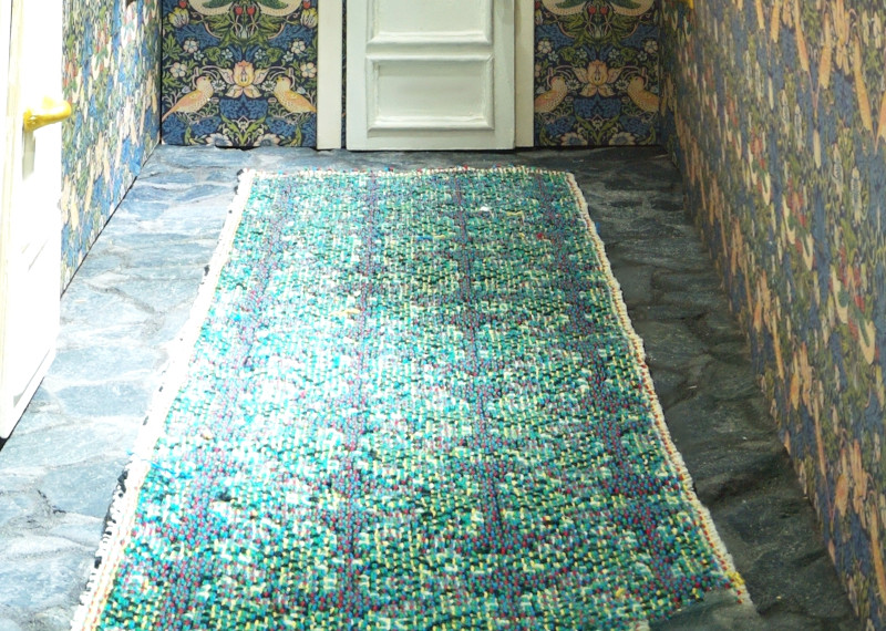
Machine-woven tapestries (which I’m using for rugs) are very low-res – 14ppi (which is, at my scale, 14 pixels per foot, which is not very realistic, but it’s probably forgivable). The way they work is really neat (but requires some pre-planning): they have six colors of yarn: red, green, yellow, blue, white, and black. Depending on the color of each pixel of your image, a different color ends up on top. I wish I had known about this in advance, so that I could have designed my images to do my own dithering, but this doesn’t seem to be a supported mode of operation for the services I found. I guess palletized pixel work is a dying art.
2. Git hosting
I quickly learned that git hosting was going to be an expense. I started with Gitlab’s free tier, but that has a limit of 10GB. I would have liked to give them money, but their pricing for additional storage is $0.50/GB/mo, which is outrageous – S3 charges $0.023/GB/mo, which is less than a twentieth of the price. I assume that Gitlab charges such high prices to account for the data transfer costs, but my data is basically write-only, so it’s a bad deal for me.
With seven rooms photographed so far, my repo right now is 53 GB, since I’m storing all of the photos that go into each focus-stack, as well as the raw (xcf) versions of each shot so that I can edit and color-correct without repeated JPEG compression. I ended up just running my own Gitlab on a cheap Hetzner VPS, which was trivial to set up, and not very expensive. It probably has less reliability than Gitlab’s service, but I have Hetzner’s backups and also my own desktop’s backups, so I am not too worried.
3. Animation
Yossi warned me about this, but I didn’t listen: AI isn’t actually good at tweening. It worked really well when I just had wool roving moving around:
But then I tried to use it to tween a solid object rotating 60 degrees:
This is surprisingly bad. But I thought: maybe it’s just that rotation is bad? So I tried with a door sliding down. Actually I tried it with a door sliding up, but I didn’t save the result, and then when I went to re-create it for this blog post, the images ended up in reverse order, so I guess it’s sliding down now. I’m not counting this as one of my six mistakes – you get that one for free.
Admittedly, the motion on the door is a bit shaky (that’s the joy of stop-motion), but I would have expected better. I guess the wool only worked because it was already, well, wooly. So I will have to live with a low framerate on most of my animations.
I can sometimes use some trickery to improve the framerate. For the animation of something rotating, what I actually do is have Godot rotate each frame while fading in the next frame. I still have a bit of the stop-motion look, since the object moves unevenly (and it’s made out of felt, so it wiggles too). And I still have decent shading, since the keyframes are photographed in situ with the correct light.
4. Shooting in confined spaces
I had thought that I could do all of the photography by placing the camera inside the dioramas. But for narrow hallways, this doesn’t work – the camera ends up too close to the wall to get a wide enough shot.
So I ended up doing something a little weird: I cut holes in the walls, and shot the side views from the outside, through the holes. Then, to make the insides look right, I put paintings or lamps or other decorations over the holes.
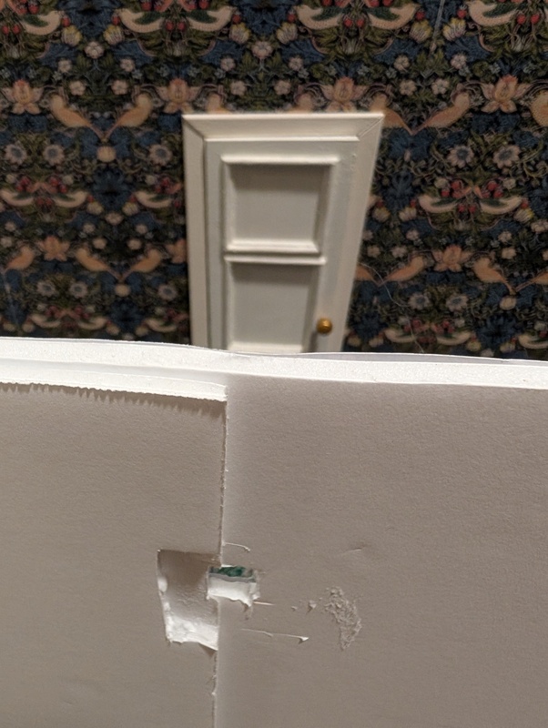
That hole fits a camera lens – I’m still suffering from my camera’s narrow field of view, but at least you can see the door. And when I’m shooting from the inside of the diorama, I pop a lamp into the hole and you would never know it’s there.
5. Steam marketing
I put up my previous blog post, which got some traction on Hacker News. Great, I thought, everyone will want to buy my game! But I forgot a step: first, people have to learn about the game, and not the seventeen people who follow my blog. It turns out that the way to do this is to get lots of people to wishlist the game on Steam.
So what I should have done is: first, create the Steam page for the game, then post the first blog post. Well, better late than never: please wishlist the game. The more folks wishlist it, the more Steam will feature it at launch, and the more folks will buy it.
6. Veneer
So then I started working on the Steam page. Steam requires nine graphics, each with a different aspect ratio. Normal people make these graphics in Photoshop or Illustrator. But High Mountain Abbey is not a normal game; it’s made of physical objects. So, of course, the Steam graphics must also be made of physical objects. I started with a piece of walnut burl veneer. Veneer is supposed to be flat, but burl wood has wild grain, so when I tried to glue the piece down, it warped like crazy. Probably I should have clamped it hard, instead of just tossing a board on top of it and hoping. Or used a non-water-based glue.
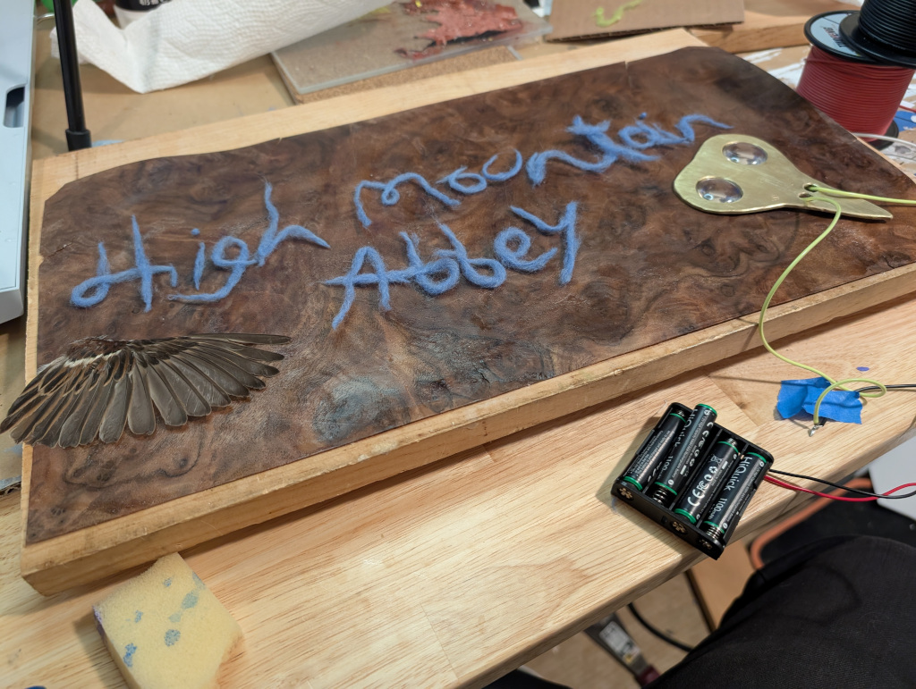
Oh well, it adds character, I tell myself.
One mistake I didn’t make
I love the idea of Rust: big abstractions, safety, performance. I feel unease with non-memory-safe languages in 2025 even though I actually really enjoy programming in C. But it would have been a mistake to build High Mountain Abbey in Rust. There’s always the temptation to make a custom engine for any game. But for this game, Godot is just fine, and I think I regret even the slight amount of weird custom stuff that I built to avoid dealing with Godot’s resource format.
Conclusion
High Mountain Abbey will be released in 2026. I can’t wait for you to play it.
Some people make games using the Unreal Engine. That’s nice, but I wanted something a little different. That’s why I’m using the Real Engine.

(OK, I’m not really calling it “Real Engine”; Epic please don’t sue me).
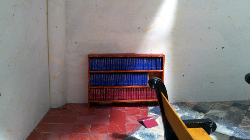
What’s the Real Engine? Simple: instead of modeling a space in Blender and then texturing it, I’m building a diorama and taking some pictures of it. Then I import it into the point-and-click game engine I built and connect up the pictures into a space. If something needs to move, I either do stop-motion animation, or I photograph the components separately and animate it within the engine.
Here’s an example:
Why?
Why would I do a cockamamie thing like this? Well, it’s not the first thing I tried. The first thing I tried was reaching out to an artist whose work I’ve been enjoying for decades, who lives in my city, and who claimed to be inspired by Myst. He agreed to work with me on the project, which was just perfect.
Then I guess he thought better of it, and he ghosted me.
So I found another artist who wanted to work with me. He didn’t ghost me. He just didn’t do the work, and eventually told me that he wasn’t going to do the work. I think there was some sort of illness involved. So we parted ways. It’s too bad, because he clearly understood where I was coming from, and had some great ideas.
So at that point, I could have gone and found yet another artist. But if two artists had failed, why would I think a third one would do any better? As Einstein supposedly said (but didn’t actually), “the definition of insanity is doing the same thing over and over and expecting different results.” Also, I had to consider my emotions: it’s heartbreaking to think you have a partner, and then realize that, actually, you don’t. I didn’t want to put myself through that again.
Now that I’ve started working on this myself, I realize that it’s possible that I was asking too much of the artists. I’m going to end up spending three times as many hours doing the art as I’ve spent on the code, at least. I’ve had thirty years of experience as a programmer, and much less as an artist, so it’s not really a fair comparison. But it’s still the truth.
How long will this take?
To get started, I prototyped a single room. Actually, I only did one end of the room, because it was just a quick test. My prototype only took a few days. So I thought that maybe it would only take a few months to do a full game. I was wrong. Here’s the room:
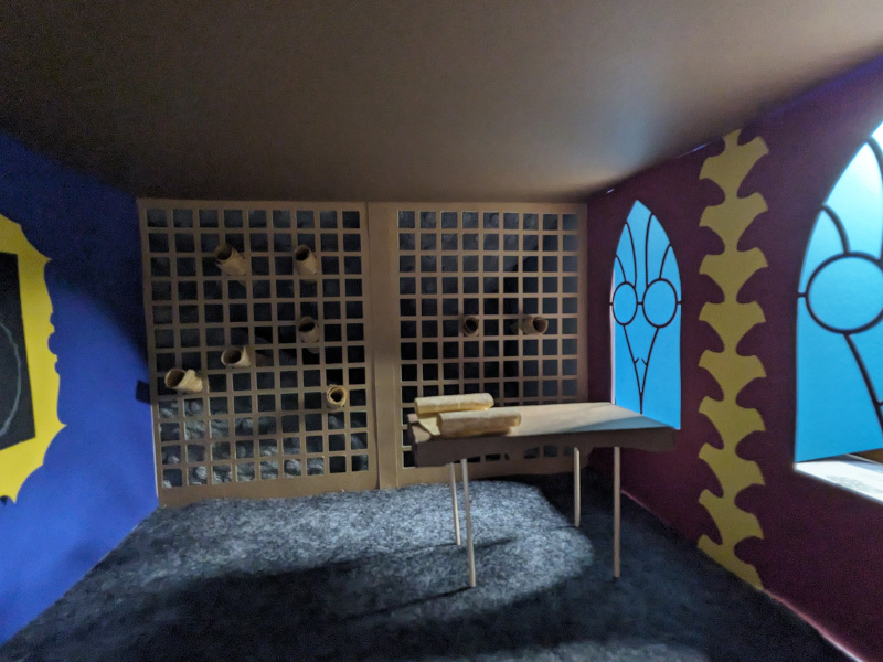
Looking at that image, I hope you’ll see why I thought this was a good idea. But look a little closer, and you’ll see why I was wrong about the timing. There are four major issues (and some minor ones):
Light leaks. The edges aren’t well sealed, because I wasn’t thinking hard about light.
You’ll notice that you can see a nubbly gray thing behind the scroll niches. That’s a random blanket that I put there to block light. I actually needed to do a bunch more construction to hide that background correctly (replacing the blanket with duvetyne would help too). Anyway, the visual design of that scroll case could use some work – the niches should be diagonal, and go less close to the walls.
The table has tiny dowels for legs, and the top is plain construction paper. I would rather have something that looks a little more like wood, and legs that aren’t so spindly – even if it’s just faux finishing.
The windows don’t have glass in them, and in fact, the muntins (or cames, or whatever the bits between the glass are called in this context) are made of the same paper as the walls.
The ceiling is flat and boring.
The depth of field is not great, about which more later.
This is the same problem that AI art has: it’s fine on first glance, and then you get closer and it all falls apart. As John Salvatier notes, "Reality has a surprising amount of detail".
The thing is: I could fix most of these – but fixing them basically means rebuilding the entire room.
So “a few days” becomes a few weeks or a month, and now I’m looking at a much longer timeline. Fortunately, nobody is going to scoop my idea, because nobody else is insane enough to build a game this way.
Prior Art
OK, maybe someone else is. There’s Harold Halibut. They’ve built real objects and then used photogrammetry to put them into a traditional 3d engine. It’s a neat idea, but my idea involves one fewer step.
Update: Also apparently Lumino City, Papetura, and The Neverhood use similar physical modeling techniques.
Why not Blender?
Why don’t I just use Blender like everyone else?
I hate Blender. I mean, I understand that it’s the standard thing that everyone uses, and I know that I would eventually get used to the UI. But almost every time I use Blender, I end up mangling the geometry in some way that requires either me to take a hundred years of clicky work to fix it, and in the end I wish I had remade the part from scratch.
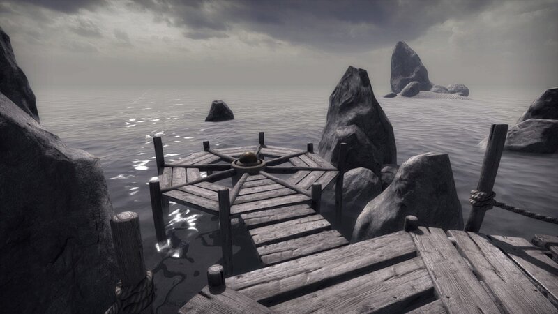
I’m not much good at textures. I could just buy a bunch of textures, but getting them to look nice together would be tough. And I would still end up with a bunch of repetition, because there’s just no way a solo dev can get enough textures. Cyan manages it – when playing Firmament, I didn’t notice any texture repetition (I did notice that the music was an incomprehensible drone, except for the totally perfect VNV Nation track at the end). But this seems to scale with studio size. In this screenshot from Quern: Undying Thoughts, take a look at the wood texture on the dock. They get a little extra mileage by mirroring the texture on alternate boards, but it’s still the same texture:
Zadbox, which created Quern, is smaller than Cyan. Going down to a single-person studio, Haven Moon is a noble effort, but I got awfully bored of seeing the exact same brick wall in dozens of places.
I didn’t want to do that to my players. The whole point of games like this is to explore a new world. But if you’ve already seen all of the textures on the first island, then you’re not really exploring a new world.
By contrast, here’s what my staircase looks like (before I install it – it’ll be in a stone tunnel, so the details might be harder to see in situ):
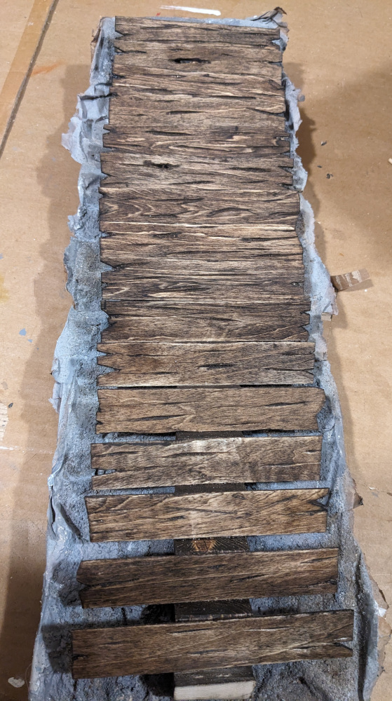
Every stair is different. Some of the angles are a little off square, which is totally fine, since it’s supposed to be sort of beat up and ramshackle.
Why not AI art?
I’ve addressed this before. But also consider the following prompt:
Painting based on Goya’s Saturn Devouring His Son, but with a giant eagle eating a tiny headless monk in a brown robe. The eagle holds the monk’s in its giant claws. Crimson fluid leaks from the monk’s neck.
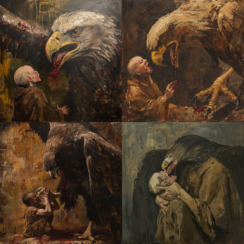
So, AI is bad at prompt following. But also, it would be really hard to have it do two images of the same room from different locations. I would probably have to generate one image, then convert it to a 3d model, and then use controlnet. I’m not sure this is less work than any of the other methods.
And even if I did build a gray box model to use with controlnet, Midjourney doesn’t even understand that if there are arches and columns, the arches have to be on top of the columns.
Process
So given that I’m going to use the Real Engine (Okay, okay, Epic, I’ll stop now), how will I do it?
What kind of space?
Myst and Riven are set on a series of islands. Haven Moon is set on a series of islands. Quern is set on a series of islands. Firmament is set in… well, I won’t say to avoid spoilers, but a small number of relatively enclosed spaces. In a game like this, any time the player tries to walk off the edge of the map and just hits an invisible wall, it’s immersion-breaking. That’s why there are so many islands.
So I needed space without a lot of freedom. I decided on an abbey high in the mountains. The mountains will be a matte painting, and most of the game will take place indoors. It’s not exactly an original setting for a mystery, but I think I’ve put my own twist on it. The setting then gave me enough inspiration to put together a story. And the story has then suggested certain aspects of the puzzles.
Roughing out
First, I drew a floorplan in Inkscape. (I’m not sharing any maps here because I don’t want to spoil the fun of exploring the space once the game is released). This just marked out the walls and doors of each room, so I could get a sense of how the pieces fit together.
Then I copied that floorplan into Blender, building up the volumes of the space. This let me more easily see how the roof lines would appear, and fly around to get a sense of scale. I guess some people can do this mentally from just a floorplan, but since I plan to have complex roofs, Blender was easier. I left some interior spaces out of the model, since they don’t have roofs.
Scale
Dollhouse scale is usually 1:12 (for a delightful note on this, search this page for "Mervyn O’Gorman" ). This makes the arithmetic easy for Americans like me who grew up with “customary units": an inch is a foot. And it’s workable for interiors: you can fit a large room on your table, if you have a big table, and you can fit a phone camera into a small room and still get things in focus.
But if you want an exterior of the entire abbey (and you definitely do!), you either need a bigger workshop than I have, or you need to take a hint from model railroading and go to 1:48 scale, which the model railroading folks call “O scale”. Having two different scales is annoying, because it means that you can’t seamlessly blend – if you want a door from the interior at 1:12 to the exterior at 1:48, you can’t just put the two dioramas next to each other, you have to put a green screen on both doors and then later paste in to each the appropriate photograph of the other one.
I think I actually will end up using a third scale because 1:12 is too teensy for some of the really complex bits, but hopefully that’s just for a room or two.
For another wonderful article of scaling, see John McPhee’s article The Ships of Port Revel, in his collection Uncommon Carriers. “At scale the mallards are thirty feet long,” is a line I often think of as I work on this project.
Photography
I had initially planned on shooting the whole thing on my phone camera. There’s a problem with this: my phone is six inches wide, and the camera is at one end, so if I have a narrow hallway, I can’t have the camera centered unless I hold it vertically (which loses resolution, since the game will be designed for 16:9). Also, the phone camera is very smart, which means that I’ll be constantly fighting it to get consistent lighting. I know there are APIs for manual mode, but building a custom Android camera app would be a lot of work.
A SLR was right out; they are giant compared to the space I’m shooting, and even macro lenses typically have too-large minimum focal distances.
Keep in mind: the camera must operate inside an entirely enclosed space, and I need to see the pictures as I go in order to make sure I’m getting what I want, and I need to do this without picking up the camera to look at a screen.
So I decided to build a camera. Well, I bought a Raspberry Pi camera module (and then a second one when the first one wasn’t good enough), and built a tiny Flask app which runs on the Pi to take pictures and allow me to adjust the exposure and focal length over wifi. The Pi is powered by one of those phone battery packs, which is cheap and runs about all day before needing a recharge. It sits on some wooden blocks so that the photos are all from the same eye level. The camera is a bit noisy, but long exposures help a lot.
Actually, I ended up buying a third camera and a second Pi. The OwlSight only has a 68 degree horizontal field of view. My aspect ratio is 16:9 (1.77:1), but for most shots it’s actually 1.956:1, because I leave a little margin around the edges so that I can show it as you rotate, making the direction of rotation clearer. So I ended up having to move the camera very far away from the wall to get enough into view. With a second camera at a slight angle to the first, I can stitch two photos into a panorama.
I’m also doing focus stacking. The idea is that a macro lens has a relatively shallow depth of field. This is a distinctive look: things shot in macro look like they are shot in macro. If you want to make large things look like macro, you use tilt-shift photography to fake this effect. If you want the opposite, you use focus stacking: take photos at multiple depths of field, and choose the in-focus parts of each. The stacking happens before the panorama, since then I don’t have to worry about panotools picking the same points of correspondence for each image pair in the stacks.
The Pi doesn’t have enough RAM to easily run focus stacking software, so my Flask app just scps the files up to my desktop, and then runs the focus-stacking software there. Then it copies the composited image back for display. Then if I like the pic, I can press a button to copy it back into the game’s assets directory (named appropriately). I also save the images from which I built each focus stack, in case I want to do more editing later.
The whole thing is slightly janky, but there’s a trade-off between spending time improving the app and actually making the game. By nature, I’m very excited about working on tools. As an indie game dev, that’s a trap. Because of the long exposures at multiple focus levels, I do have a bit of time between shots to futz with the camera code and write the post that you are reading now.
Every room I build, I learn something. For instance, the OwlSight camera’s auto white balancing seems to blow out reds. I didn’t notice that until I tried to shoot some red-orange needle-felted balls. So I’ve added manual white balancing control.
The second room I built has a rough floor. This means that the camera stand (which is literally some random wood blocks that I had laying around) doesn’t sit flat. Or maybe the floor just isn’t level to begin with – there was definitely some warping when I applied the air-dry clay to the masonite, and I’m not sure gluing braces on later quite got it all out. Mostly, I don’t care if if the camera is a bit off level, but in one case, I have a machine on the wall that needs to be dead square to avoid annoyances during animation. So I built a camera leveler with another wood scrap. It has threaded inserts at the corners, so I can turn screws to adjust the height of the four corners of the cameras.
The third room ended up having insufficiently bright lighting. I bodged together a partial solution, but it’s still going to be the dimmest room in the game. Next time I’ll use brighter LEDs.
Architecture
Architecture is really hard. Consider the chapel: I picked the shape for it based on where it fit into the rest of the monastery. There are some subtle constraints – like, I really wanted one of its walls to be blocking the view from the door to the front hall, because otherwise that door would open into the garden, which is at O scale. And I did a flat angled roof because a gable roof would be hard to square with the six-sided floorplan. Also, I think a gable roof with elaborate decorative skylights might be weird, and skylights are the only hope for lighting a room of this size.
After examining the model in Blender, I decided that it could be a chapel. A bit 1960s looking, but OK. Unfortunately, this meant trapezoidal walls, and compound angles.
The skylight wasn’t going to be quite enough light, so I added a bunch of fenestration. I decided on stained glass, and tried several ways to make it look right. In the end, one of the windows has a complex pattern which I printed on acetate, and the others have simpler patterns which are alcohol-based ink on acrylic. The acetate is brighter, but the acrylic is good enough and comes in larger sizes.
Of course, the windows have to be high enough that you can’t see much out of them, because outside the windows is the garden, which is still a different scale. I guess I could have just planted some trees right outside, and built two scales of tree, but then I wouldn’t as much extra light. With high windows, the sky will still be visible. So I just painted a rough blue-white gradient on some cardboard, which, through the acrylic, is good enough.
If this were actually built in the 1960s, the windows would be aluminum rectangles. But rectangles are boring. I went with bird-inspired shapes, which are hopefully a bit Gaudi-esque. Birds are a big theme in this game, for reasons players will discover.
I made the chapel floor with “stone” tiles. To make tiles, I used poured paint on paper, cut into squares. This was a bad decision, because I had to pour like a dozen sheets to get enough squares, and then I had to glue them down (I used gray paint as the glue, so it could double as mortar). The good decision I made was to align it diagonally, which meant that I could hide some of the unevenness. But then I didn’t do a great job of getting straight lines, so I had to trim some of the tiles. Probably nobody will notice. Also the tiles peeled some, which means that the floor looks kind of cracked. Fortunately, the story of the game makes this not totally unreasonable, so I’ll just knock over some of the pews and throw some prayer books around, and say there some sort of catastrophe here.
The walls are covered with Thai kozo paper. But where the paper joins, it doesn’t look great, so I built some columns to cover those places up. The columns are foam covered with more kozo paper. For a couple of the interior corners, I used some wood framing. There are a lot of little decisions like this: I need to cover an edge or a corner, so I add a little trim, which ends up adding visual interest to the space.
Tools and materials
Premade dollhouse furniture
No. If I do that, my game will look like everyone else’s dollhouse. Also, in theory it’s copyright-infringing, although in practice, I’m unlikely to get sued. I tried to use some lighting marketed for dollhouses just to avoid wiring my own LEDs, but they ended up not being bright enough. Dollhouses usually have one open wall so that you can get Sandy Toksvig inside them, so lighting inside a dollhouse is for looks not for illumination. So I won’t try that again.
3d Printing
I want to avoid 3d printing as much as possible, because 3d printed stuff lacks that handmade look. Also, it means I have to use Blender. Well, when I’m lucky, OpenSCAD. I have needed a few prints. First I ordered online, then I borrowed my brother-in-law’s, and now my wife brought me home a 3d printer that someone in her office was just giving away for some reason (this is how the rich get richer).
The other bad thing about 3d printing is layer lines. I had some bench parts printed, and I thought I could cover up the layer lines with acrylic paint, but it it turned out that even two layers of gesso followed by two layers of paint didn’t solve the problem. When your camera is four inches from the subject, every little line shows. The actual solution is XTC-3D, which is a rather unpleasant product: expensive, short pot life, hard to apply thinly, and weird-smelling. But it does the job, which is the important thing.
Speaking of extremely fine details, my workshop is unfortunately also inhabited by two long-haired cats. Every time I see them, I think “Did he who made the lamb make thee, and if so, why did he make you shed so damn much?” Keeping the hair out of the dioramas is quite tricky, and I often find that I have to remove a stray hair and reshoot.

Clay
Even though I have a full pottery studio with a kiln, I’m going to use very little ceramic clay for this project. One reason is that the cycle time is high: I need to accumulate enough stuff to fill a kiln, and then run the kiln, and then glaze, and then run the kiln again.
Ceramics has a very distinctive look, which is mostly not what I want for this space. I do have plans for a couple of pieces – which, given the cycle time, I should probably start on.
Some of the door moldings are made from DAS air-dry clay. It’s nowhere near as nice to work with as real clay, but it’s surprisingly strong – you can pick up a piece of molding that’s 1/16” thick and 7” long by one end, and it won’t break. Try that with green stoneware clay and you’ll have a bad day. And you can cut it with a knife even when it’s dry. I also made a vase out of it, but getting something round at that scale with that clay is tricky. I should probably just use real clay for that.
Epoxy clay is really nice to work with, if you’re quick. I made doorknob parts with it, and filled in some of the cracks in the door moldings. It’s hard as a rock once it’s dry, so you don’t want to be too sloppy, but it remains sandable when hard.
Needle felting
Instead of glowing screens, I’m probably going to do most of the screen-like puzzles using needle felting. I think in my ideal world, every puzzle would have a reasonable and diegetic hardware manifestation, but that’s not quite how the puzzle design ended up going.
So far, it’s a lot of fun. I’m not anywhere near the level of Andrea Love, but I can make cool stuff. For my first animation, I made ten frames (for each of the three animations), then I used RIFE to add three frames in between each of my originals. I think this was especially helpful at the end of the animation, since my animation loops back to the first frame, but the felt didn’t end up exactly perfect. At 20 FPS, it still looks like stop-motion, which I think matches well with the handmade look of the rest of the game. I’ll probably reduce the frame rate of the other animations in the scene, and add a little jitter, to match.
(This video has a white rim which will be masked out in the actual game – doing alpha channels in video is tricky, so I’ve just written little shader which applies a mask at runtime)
Release
I’m really excited to be working on this project. I go to work every day happy, and I fall asleep thinking about what I’ll do next. I can’t wait to show you the world I’ve built.
High Mountain Abbey will be released once I have designed, constructed, and photographed a lot of dioramas. Hopefully 2025 but early 2026 is more likely.
Here’s an update on my game Middles.
Dominus told me that Bill Gosper was also inspired by …MEOW…, and made a version of this game. His version allows only four-letter substrings, and allows those substrings to occur anywhere in the word (so GULC would be valid). When Dominus mentioned Gosper’s work, I assumed that it was in, like, 1983, since Gosper is fifteen years older than my parents, but it was actually just a couple of years ago. So I’m not that far behind the curve. Update: No, actually I am way late. Dominus further informs me that he learned about it in More Mathematical People(1990), p 114. Gosper attributes it to a friend of his.
A former co-worker mentions Wordiply, a Guardian game with non-unique middles. I hate it, because the longest words are very often a mess of affixes. Consider “utel": the best word is “absofuckinglutely”, which contains both an infix and a suffix; the best word they are likely to actually accept is is “irresolutely”, which contains both a prefix and a suffix. And they let you riff on affixes, so you can do things like remitting, remittingly, unremittingly; this is often a totally reasonable strategy. There’s nothing wrong with affixes, but there’s also nothing interesting about affixes.
A game that plays somewhat like Middles is Superghost; Jed Hartman describes it nicely; there, the goal is not to make a word. Another friend mentioned it in the context of a James Thurber piece from 1951 (paywalled; your library may have New Yorker archive access). The logical next step is, of course, Superduperghost, which allows inserting letters at any position. Jed Hartman also describes this version; Wikipedia says it wasn’t invented until 1970, which seems surprising.
Hartman also mentions “the occasional several-minute wait between letters”, which points to a problem with this whole category of games: without a time limit, you can often spend hours thinking about a turn. Gil Hova’s Prolix solves this problem with a timer. This is a problem I complain about whenever someone wants to play Codenames. Yes, Codenames comes with a timer, but nobody uses it, and it’s too long anyway. This is one reason I wanted a game like Surfwords.
There are often a lot of ways to approach the same game concept. Today I was at MoMath and discovered Balance Beans. I had definitely considered making a game on this premise, but mine was going to be a computer game, and it was going to involve trucks trying to drive across the balance beam, with some slop in the system to allow a truck to be driven onto just one side. Also, my trucks were going to have different weights at the same one-square size, as opposed to having size and weight conflated and having connected groups. After playing it, I think their choices might be better. But mine would have offered some neat sequencing puzzles. (Just a note: their physical design is a bit crap; if you aren’t careful while removing a piece from the heavy side, the motion will disrupt some of the other pieces).
PS: I’ve also corrected a flaw in Middles. Dominus and another player mentioned that yesterday’s EYAN could be the somewhat obscure word ABEYANCE instead of the expected CONVEYANCE. I’ve added a button for this situation, which lets you enter an alternate answer and (if your alternate answer is on my long word list and you entered a letter that would have been correct for the alternate answer) gives you a point back. This is a weird solution, but I didn’t want to just accept alternate answers as you type them, since that could lead a user to a word that they think is obscure.
I made Middles, a daily word game.
A while ago, I worked a company whose initials were TS. This led to some fun times: Accounts that started with TS were assumed to be system accounts, so when a human named Tsutomo (or something) joined the company, his account got treated weirdly. IIRC we renamed his account rather than changing the system.
I was working on version control, and we wanted to find a name for the new system, so I suggested “nuTShell”, being the best word I could find that contains the letters “ts” in the middle. My team lead immediately replied, “O God, I could be bounded in a nut shell and count myself a king of infinite space.” Which is exactly what I was thinking. But nobody else seemed to appreciate the Shakespeare, so we went with a different name.
And then there’s this Tumblr post. (It will probably get lost, so for future reference, it reads: “List of words containing “meow”: meow, meowed, meowing, meows, homeowner"). The original version of that Tumblr post (since deleted) is from 2016; I don’t remember when I saw it. But it’s been living in my head ever since, and eventually, I realized that there was a game there.
The game works like this: I give you the middle of a word, and you try to guess the rest, one letter at a time. Every time you guess wrong, you lose a point. At zero points, you lose. The secret word is chosen so that its middle is unique among commonly-known words (ignoring plural nouns and singular verbs). For instance, the middle OBC appears in the common word BOBCAT and no other common singular word (it also appears in the uncommon word MOBCAP, a kind of bonnet that nobody has heard of).
There are a lot of words that have unique middles that nonetheless are bad candidates. DUSTRIO is bad because it’s obviously INDUSTRIOUS. WJ is bad because it’s NSFW. INGEM is bad because while INFRINGEMENT is the more common word, IMPINGEMENT is common enough that some players will know it. For this determination, I used a combination of Brysbaert, M., et al and my own personal judgement (they think impingement is non-prevalent, but I think it’s prevalent, possibly wrongly, because it’s something I’ve experienced). Also, Brysbaert is lemmatized, which makes life harder.
But I have about 4,000 words (I still might remove some when I take another look), which is over a decade of game before repating. Not quite Wordle, but not bad.
I don’t want to review the whole game. But I do want to talk about one puzzle that I found infuriating. No, not that one, which could so easily have been improved. A different one. Not because it was hard (it wasn’t). But because it had a bizarre design. I’m going to spoil some minor aspects of the puzzle, but not the interesting part.
Here’s the set-up. Actually, here’s the pre-set-up: puzzles in the game are both entirely arbitrary and entirely diegetic: some asshole has stranded you on this puzzle archipelago and is forcing you to solve his puzzles.
OK, now the set-up: You’re on an island. There are two other islands, one to the South and one to the North, and you can’t presently get to either island.
There’s a green laser thing shooting out of a crystal. You can rotate a reflector doohickey to make it point to another crystal on the North island, at which point you can press a button and “ride” the laser across. There’s also a crystal on the South island, but you can’t point to that one because it’s too high up. There are other reflector doohickeys visible but not reachable.
When you get to the North island, you find a machine (actually, two, but they function in tandem), and more reflectors. The machine controls (in a way that I will leave vague) the enablement and orientation of all of the reflectors. You also find a piece of paper which describes a particular set of reflector orientations that it wishes you to achieve.
If you manipulate the machine appropriately, you can make the reflectors assume this orientation (and enable them all). This machine is pretty cool. Not the world’s most innovative puzzle, but (unlike many of Quern’s puzzles), not readily susceptible to brute force. I did not regret the minutes I spent figuring out how to make it do the thing.
Completing the pattern gives you a new way to travel back to the central island. It also makes a lever pop up, which lets you adjust the initial reflector upwards so you can hit the crystal on the South island.
This is stupid.
The path that the new pattern sends you on takes you around the otherwise inaccessible back side of the central island. Instead of having the South island crystal high up, they should have had it obstructed so that it could only be reached from the back. You would still need to do roughly the same reflector manipulation, but instead of doing it because a piece of paper told you to, you would be doing it because it would directly let you reach your goal. There’s no need for the lever, in that case, and no need for the piece of paper. (This also requires either a slight change in the mechanics of crystals, or one more crystal, but neither would break the rest of the game).
This would have a subtly different effect, in that you couldn’t travel directly from the central island to the South island. But that’s not a path you need to take more than once (OK, twice, I didn’t notice something the first time I was there). And anyway, once you’re there, a fast return path could have been provided (Quern does a lot of this).
The reason my design is better is:
It is more interesting to figure out how to use a tool to accomplish your goal than it is to figure out how to input a pattern because a piece of paper told you to.
The lever is an unnecessary piece of hardware that doesn’t contribute to making the puzzle harder or more interesting.
Possibly even better would be to have the reflectors arranged roughly as they currently are, but while you’re riding the laser the long way around the back of the island, you can see something that you would then need to use to decide how to change the routing. I am not sure this idea would actually be better, because I found the laser-riding to be headache-inducing. But at least it would have fully used the possibilities of the set-up.
Maybe you could argue that it’s diegetic that the puzzle has this weird lever epicycle (because the dude who has trapped you here is just not a good puzzle designer), but that is the last refuge of the scoundrel.
Have you noticed the turds?
Before I begin, let me say that I’m not dissing Generated Adventure or the people who created it. They made a very impressive tech demo in 72 hours, and if you don’t look too closely, it’s rather pretty. They were under tight time pressure, and they were specifically aiming to use only AI tools. They did better than I would have in 72 hours (although as a parent, the idea of devoting 72 straight hours to anything is totally unimaginable). It’s good enough to make me consider Deform over Godot for a project like this (I’m sure either could handle it, but they did it so fast!).
But I feel like something that gets lost in the discussion of AI-generated artwork is the turds. Here’s an example of what I mean: it’s one of the sets of images that Midjourney generated for Generated Adventure (I don’t think any of them ended up being used for the game).
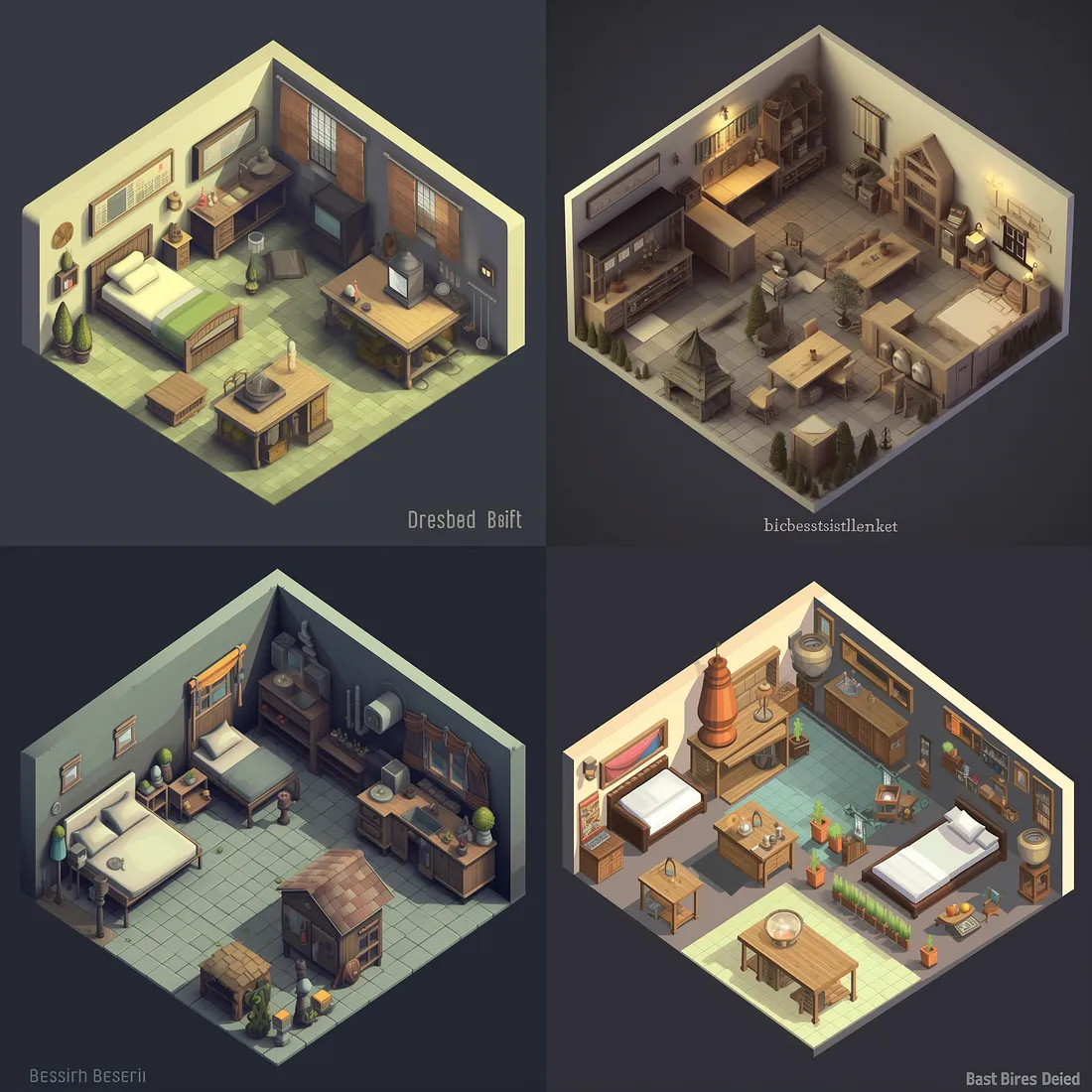
At first glance, it’s fine. But then you notice the turds.
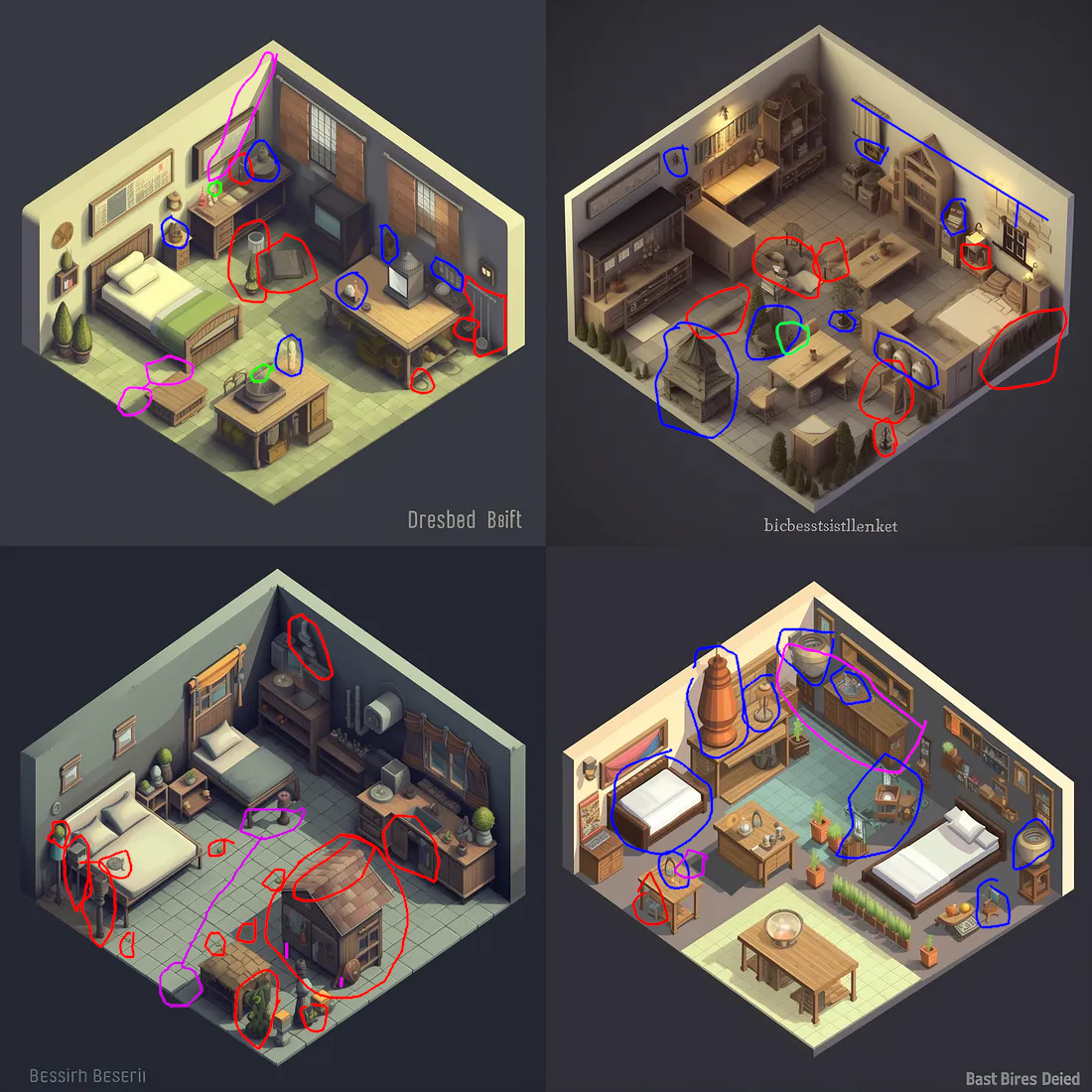
Here’s what I mean. Green marks blurry object edges, which I’ve complained about before. Some of these might be the webp compression of the image from the Medium post, so I haven’t been too harsh here. Purple marks bad angles: shadows that don’t match, a wall that’s also a floor, and different-length legs on a … well, I have no idea what that thing is. Blue generally marks things that are unidentifiable, although in the top-right one, it marks the only floor-tree (?) that has a pot. Unidentifiable stuff is a venial sin; it’s a fantasy game, and sometimes there’s weird stuff in a fantasy world.
Red is the real turds. Stuff that is so our-of-place as to break immersion. Often it’s unidentifiable, but sometimes it’s just in the wrong spot (like the faucet in the top left which isn’t over a sink). The bottom left has a fractal turd: the roof of the hutch has a weird asymmetrical fold at the top, but also, a bedroom should not contain a hutch with an outdoor roof.
Once you start looking at AI-generated art, the turds are everywhere. Midjourney often “solves” this by doing images that are impressionistic rather than representational. I googled for “Midjourney dragon”, and this was the first hit:
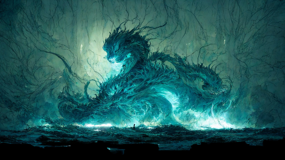
Other than the inexplicable human figure (?) in the center of the image walking on water, this doesn’t have major turds – but it’s also clearly intended to impressionistic rather than to represent a real scene. I should note that several of the other images from that source do have turds, such as phantom Chinese-looking characters. Side note: I wonder why the dragons are disproportionately looking to the left. In one image, the main dragon head is looking to the right, but clearly that was unacceptable, so there’s also a secondary head-turd looking to the left.
Music
I’m not any good at music, so I can’t immediately identify the musical turds in the AI-generated music from AIVA. This is what Generated Adventure used. AIVA seem to be generating MIDI files, so they won’t have the same sorts of errors as AI image generators, which operate on a pixel level. But I can say that their prompt following is bad. I uploaded the first track of the Surfwords soundtrack to AIVA. Here’s what it sounds like:
That’s a track composed by a human. One of the tracks that I sent him as inspiration was this one (skip to 0:24):
He nailed it! Patrick’s track is maybe a little less skrawnky, but it definitely captures the feeling and instrumentation.
Compare AIVA (I uploaded Patrick’s track rather than the Moon Hooch as a “influence”, since I have the rights to it):
Sure, the BPM is the same (according to a random online BPM detector). Maybe the key signature is also the same? But it’s not even the right instruments – AIVA suggested “Clean Rock Ensemble” for this track, but my track is brass. (AIVA’s generated tracks with the same influence on the Brass Ensemble setting sound even less like the original).
If you don’t have a vision in mind for what your music sounds like, AIVA is maybe fine. Like, it sounds like generic music. But if you do have a vision in mind (as I did for the Surfwords music), AIVA is not there yet.
Conclusion
Please don’t tell me about how I could fix this by twiddling the Midjourney or AIVA prompts.
AIVA’s config options seem to be designed for people who understand music much better than I do. Maybe it’s a good tool if that’s your situation. But why offer to let me upload an influence, if you aren’t going to do anything other than extract the BPM and key signature? At least get the instruments right!
And yes, you can paint out the turds in Midjourney and tell it to fill in the area again until it gets it right. But the shadows are still going to be annoying, and the iteration time is painfully slow.
Soon, this might be fixed. But not today. It’s frustrating to be so close, and to have everyone hyping how close we are, and to be stuck with turds . (Also please don’t say mean things about the Generated Adventure folks, who set out to do a thing and successfully did the thing; none of this is directed at them).